Author(s) : Ethan Marcotte
The Responsive Design
Internet, and its interface is growing very rapidly and create innovations every day. However, they must confront regularly to various constraints.
We can now ask how the web, this new platform is based on our knowledge? But also how a site fits our various tools such as smartphone or tablet?
These two hypotheses will help us to develop the concept of "Responsive Design".
On the one hand "The Web", this new digital world has its own codes. However, its principles are derived from real domains.
1. In a first step, we will look to its interface
The creator of the website has to choose his own canvas in order to spread its "desires", his work as an artist who expresses his emotions. The word "canvas" retains its full meaning here, we can even extend its sense and compare the "web" to a "cobweb" because it is composed of yarns that make up the network. This thread will allow the spider to catch its prey and live. The canvas of this website approaches this significance because the creator of a website will make every effort to ensure that his site is attractive and should be the subject of targeted research. That will generate the flow. Having special offers, they will push the consumer to buy. The site will live with his income.

- In addition, we can see that in a website, there are: titles, headings, paragraphs, etc.. These words impose real code to this flexible surface. By imposing this, website’s creators allow the user to simply understand their digital platform. The user will know by a a glance the theme of the site with his name, he has a brief description in the search page and will even offer to click on "sub-categories". This can be compared to a book, when the title is vague, the reader have to read the back cover to quickly understand the theme of his book. Here, the principles of the printing are applied.

2. Now we will look at the construction of the website to be visible by any tool.
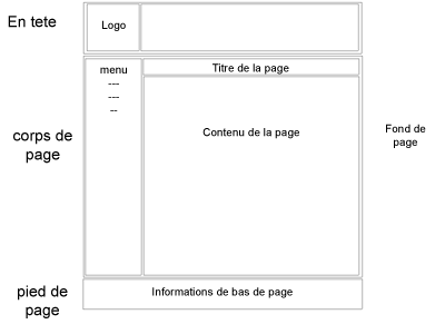
- The interface of a website is composed of headings, columns, tabs, banners etc.. All this, is set up through the work of webdesigner. He has a role of architect but specializes in ergonomics, aestheticism’s websites. Previously internet was dedicated "solely" to computers. Therefore, each page website could have a larger or smaller size according to the screen type and its resolution. It should be flexible in order to adapt to each screen to avoid bad ergonomics. It’s necessary that the user finds the site "fun" to watch. For example: if the site is improperly sized, the user must scroll the page from the left to the right in order to have a global vision of the site. This will be unpleasant, and he will leave very quickly the website.

There were in 2011 about 40 million users (Fevad, 2011) in France. Knowing that 12% of French (= 3 million) have already made purchases from their mobile. This figure is small today but tends to develop in several years. For this reason adapting a website for mobile and tablet is a real challenge, especially in terms of development for the company and optimization.
We will develop the concept of "Responsive Design".
- A website is "Responsive" when it adapts to any screen (resolution), either a computer screen, smartphone or tablet.


- The user must be able to navigate without a problem. When this is not effective, the user can not feel any pleasure and will be restricted. Some web designers decided to create a website for each tool, but when users want to share the mobile URL with a friend or colleague who receives it in his mailbox. He will be confronted with the ergonomics "mobile" on his computer. Reading the site will require more effort for the person and she will be incommoded by the format.
- Then, the site is "Design" because in addition to adapt to any type of resolution, it must be ergonomic. The navigation will be different between a computer and a smartphone. Thus, columns, headings and other tabs have a different position. It is necessary for user interface is attractive, but also ergonomic.

Finally, by joining the two words: "Responsive + Design" we access a concept that simplifies the user experience and enables businesses to be seen and read anytime, anywhere.

